Project 01
Climate Change Trend Analysis & Forecasting
Analysis and forecasting of country-level CO₂ emissions using historical climate data, with country-level time-series modelling and an interactive Streamlit application.
- Year
- 2026
- Role
- Data analysis · Time-series modelling · Application development
- Status
- Completed
- Categories
- Machine Learning, Data
Problem
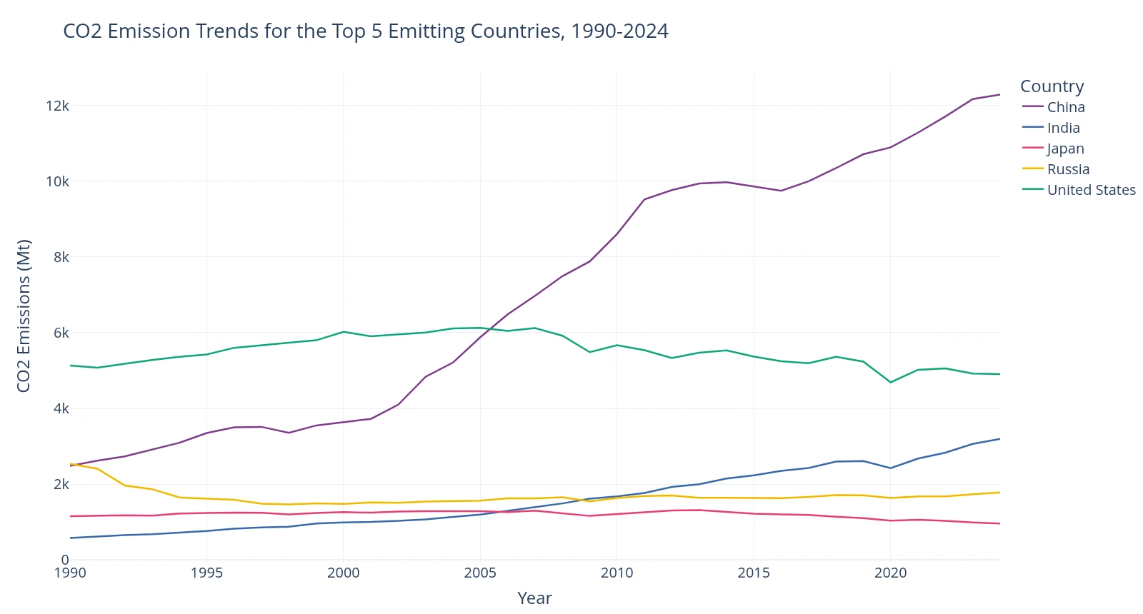
Carbon dioxide emissions differ widely between countries and change over time. Some national series climb for years, some level off, and some decline. Reading a single global number hides that variation.
This project asks two concrete questions. What do the historical CO₂ emission trends of a selected group of countries look like since 1990, and what does a simple, transparent time-series model forecast for each of them?
The goal is an understandable workflow that runs from a public dataset to a forecast for each country. It is a modelling exercise, not a policy assessment, and it makes no claim about the effect of any policy.
Data & Scope
The data comes from the Our World in Data (OWID) CO₂ and greenhouse gas dataset. The analysis uses annual records from 1990 onward and covers ten countries:
- China
- India
- Russia
- Japan
- Germany
- Brazil
- South Africa
- Australia
- United Kingdom
- United States
The OWID file lists aggregate regions alongside individual countries: the world total, continents and income groups. Those aggregates carry no ISO country code, so they are removed by keeping only rows that have one. Every series then describes a single country and nothing is counted twice.
Approach
The workflow has five steps.
- Clean and filter. Keep sovereign countries, restrict the records to 1990 onward and select the ten focus countries.
- Explore the trends. Chart global emissions, the five largest emitters and the mix of gases by decade before choosing a model.
- Engineer features. Add lagged emissions, a five-year rolling mean, year-on-year growth and a GHG-intensity measure for the supervised benchmark models.
- Split by time. Fit on 1990–2018 and hold 2019 onward out for testing. The test window includes the 2020 COVID-19 dip, which makes it a demanding check.
- Forecast country by country. Fit a separate ETS model to each country’s series, compare it with three simpler benchmarks, and turn the forecasts into mitigation scenarios.
Model Design
Each country is treated as an annual series and modelled with the ExponentialSmoothing class from statsmodels, configured with an additive trend, a damped trend and no seasonal component:
ExponentialSmoothing(series, trend="add", damped_trend=True, seasonal=None)
This is ETS(A,Ad,N)-style modelling: additive error and trend, a damped trend, and no seasonality. Annual observations have no within-year seasonal pattern, so the seasonal component is switched off. A damped trend lets the slope flatten over the forecast horizon instead of continuing indefinitely.
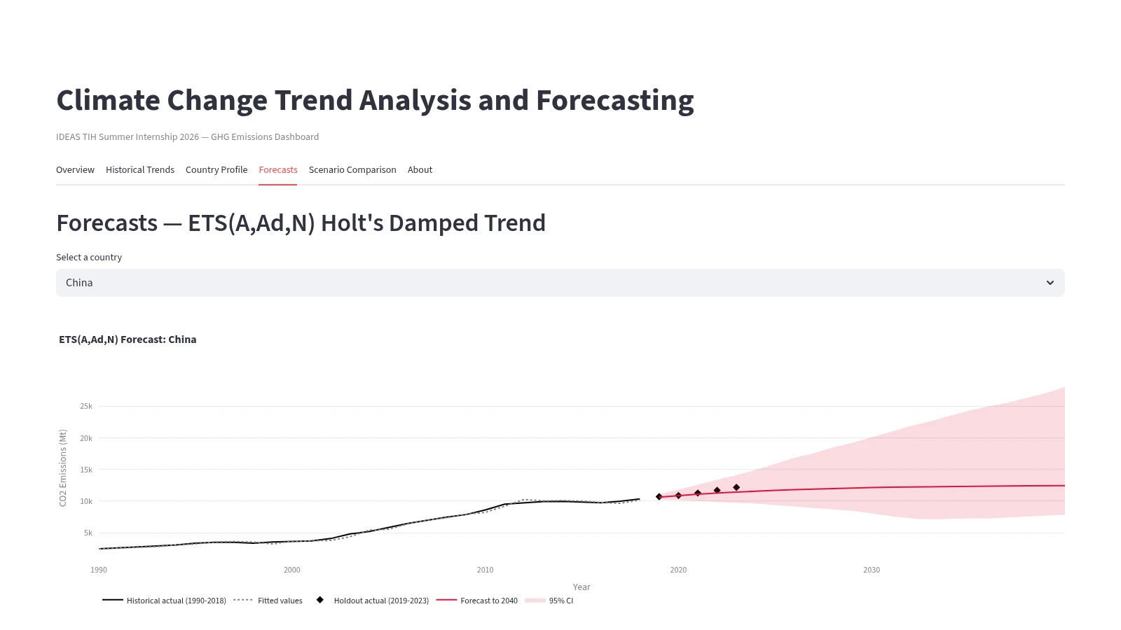
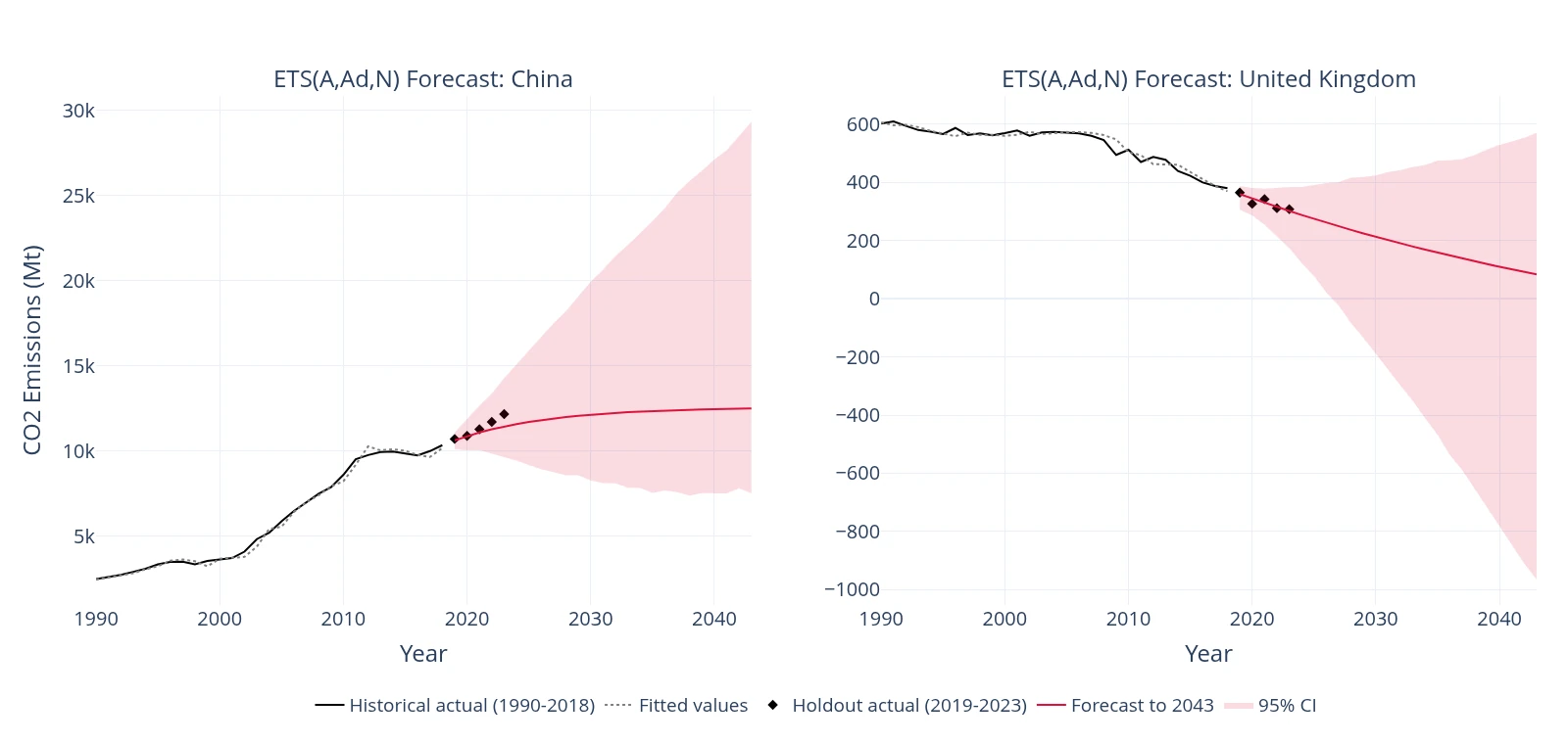
Each model is fitted on 1990–2018 and forecasts through 2043. The 95% intervals come from 1,000 bootstrap simulations of the fitted model.
Three benchmarks sit alongside it: a naive model that repeats last year’s value, a per-country linear regression on the engineered features, and one pooled random forest across all ten countries. The configuration is fixed. The project did not include a hyperparameter search.
Evaluation & Results
The models are compared on the 2019–2023 holdout using mean absolute error (MAE) in million tonnes of CO₂. Lower is better.
| Country | Naive baseline | Linear regression | Random forest | ETS(A,Ad,N) | Lowest error |
|---|---|---|---|---|---|
| China | 315.1 | 209.6 | 1189.2 | 290.5 | Linear regression |
| United States | 212.5 | 493.5 | 366.3 | 297.4 | Naive baseline |
| India | 191.8 | 164.7 | 158.8 | 210.4 | Random forest |
| Russia | 44.2 | 28.1 | 35.2 | 31.6 | Linear regression |
| Japan | 36.5 | 73.8 | 103.0 | 95.9 | Naive baseline |
| Germany | 39.6 | 93.5 | 88.1 | 104.6 | Naive baseline |
| Brazil | 19.7 | 61.7 | 17.3 | 17.5 | Random forest |
| United Kingdom | 18.8 | 21.0 | 41.4 | 9.4 | ETS(A,Ad,N) |
| South Africa | 12.3 | 32.2 | 14.7 | 22.8 | Naive baseline |
| Australia | 6.7 | 19.9 | 10.2 | 26.2 | Naive baseline |
The result is mixed, and it says something useful. The naive no-change model has the lowest error in five of the ten countries, because annual emissions rarely swing far outside a shock like 2020. Linear regression and the random forest each win two countries, and ETS wins one, the United Kingdom, where a steady, decelerating decline suits a damped trend.
Two cautions apply. The comparison is not like for like: the benchmarks predict one year ahead and are refreshed with each new observation, while ETS makes a single five-year forecast from a 2018 fit. The table is a directional comparison, not a leaderboard. And a pooled random forest cannot predict beyond the range of emissions it was trained on, which is why its error for China is far larger than for any other model.
A single-series model uses only each country’s own history. It does not model economic, policy or technology drivers, so its output is a trend extrapolation and not a prediction of what will happen. The intervals are not constrained to stay above zero either: the United Kingdom band dips below zero later in the horizon, which is a reminder to read long-range intervals as indicative only.
Application
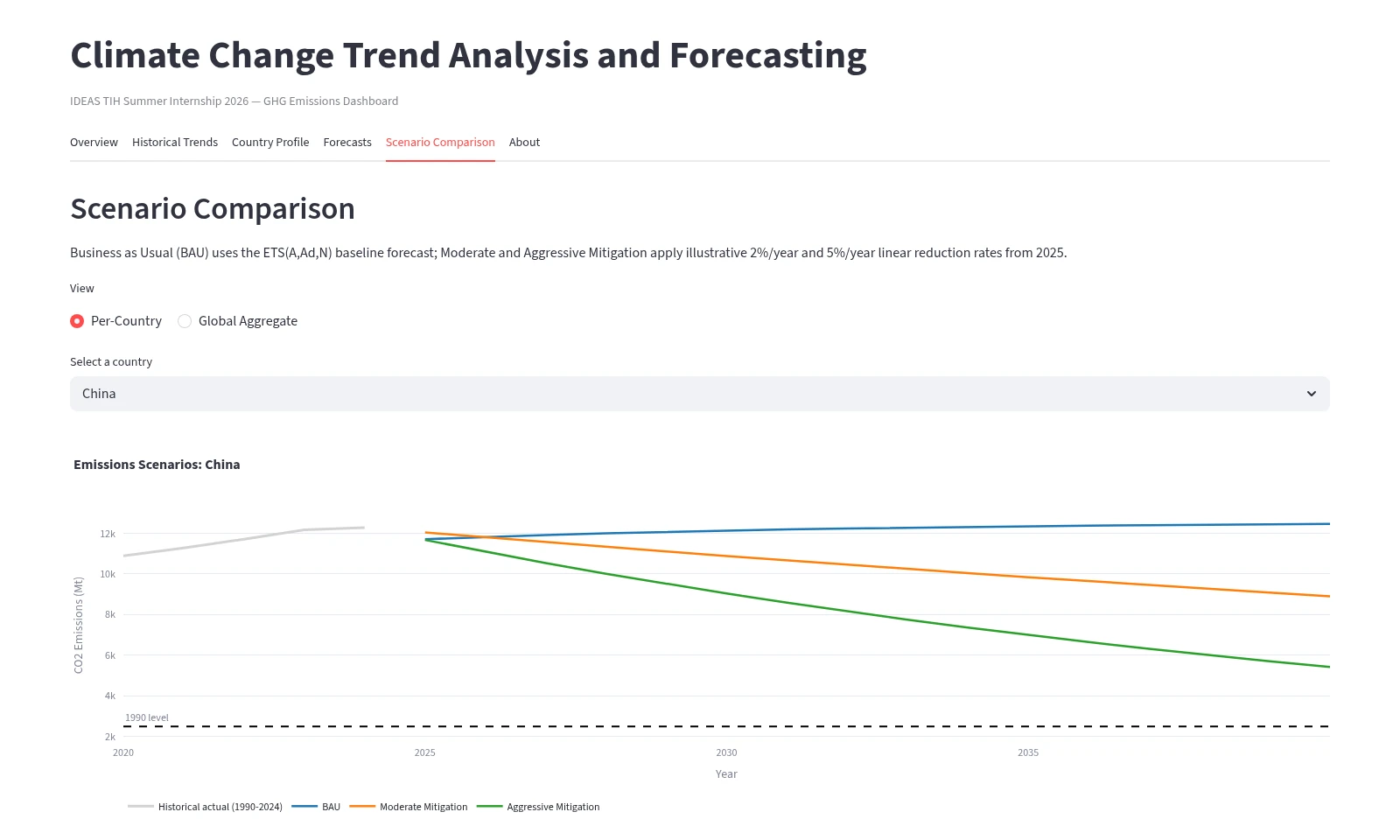
The analysis is wrapped in a Streamlit dashboard so the trends and forecasts can be explored interactively instead of only through static charts. It has six views: Overview, Historical Trends, Country Profile, Forecasts, Scenario Comparison and About. You can compare countries, inspect each country’s ETS forecast against its holdout, and switch between business-as-usual and two mitigation scenarios.
The scenarios are illustrative. Business as usual is the ETS forecast, and the moderate and aggressive cases apply constant reductions of 2% and 5% a year from the 2024 level. They are not calibrated policy pathways.
Architecture
The system is a linear pipeline. Data moves from the public dataset through cleaning, per-country series and the model, and out to the interface.
OWID dataset
Our World in Data CO₂ and GHG dataset
Cleaning / filtering
Sovereign countries, 1990 onward, ten focus countries
Country series
One annual series per country
ETS model
statsmodels ExponentialSmoothing, additive damped trend, no seasonality
Forecast / evaluation
2019–2023 holdout comparison; forecasts to 2043 with 95% intervals
Streamlit interface
Interactive dashboard for trends, forecasts and scenarios
Challenges
- Country naming and selection. Countries and aggregate regions sit in the same table. Aggregates have no ISO code, so filtering on that field, rather than on names, keeps only sovereign countries.
- Incomplete columns. Not every column is populated for every country and year. GDP, and therefore the GHG-intensity feature, has gaps in the most recent years because of reporting lag, so the models lean on the emissions series itself.
- Annual, non-seasonal data. One observation per year means there is no seasonal pattern to exploit, and each country has only about 30 training rows. That is too few for a random forest per country, which is why a single pooled forest is used instead.
- Evaluating a forecast. Time-series data cannot be shuffled into a random split. The test years have to come after the training years, and one-step-ahead benchmarks are not directly comparable with a multi-year forecast.
What I Learned
Working on this project sharpened my sense of what a time-series model can and cannot say. A no-change baseline turned out to be hard to beat, which is a good reminder to measure every model against it before claiming it adds value. Model complexity has to match the amount of data: a simple per-country regression often did better than a random forest that had too little data to use its flexibility.
It also reinforced how much of the work is data quality: choosing the right rows, handling gaps and being explicit about scope come before any modelling. Holding out later years, rather than judging a model on the data it was fitted to, is what makes an evaluation meaningful.
Finally, turning the analysis into a Streamlit application showed me the difference between an analysis that works and a tool someone else can use.